INTRODUCTION

Return to dealing with events and branding related to them is for us a great happiness. Mostly if these concern the university field where, in the past years, we have worked on experiences that have filled with thousands of participants the squares of Udine (the festival Conoscenza in Festa) and Siena (SIYFEST, the international festival dedicated to Millennials).
The occasion this time comes from the Celebrations for the 800 years since the foundation of the University of Federico II of Naples, in 2024, which brings with it the realisation of ambitious communication objectives and artistic direction for which the University relies on the advice of the Zeranta Group. These celebrations are a unique opportunity to consolidate, strengthen and innovate the image and function of the Neapolitan institution as an accelerator of change for the entire territory of Campania and Southern Italy, in an international perspective.

HOW DID THE FII800 BRAND COME ABOUT?

The processes are at the beginning common ones.
We have taken to heart the mission of the University, which is the first secular university in the world and among the oldest in Europe. A state university, multifaceted, multidisciplinary, multi-secular, internationally connected and rooted in a wide territory.
We focused on the Federician path and design, identifying four distinctive elements that we report as:
  • the visionary man;
  • the innovative man:
  • the global and multicultural man;
  • the man of institutions.
We also welcomed the need to convey an aspect that distinguishes the history of the University of Federico II and its relationship with change, synthesizing the concepts to follow:
  • Changing the places, because over time the University has spread throughout the territory.
  • Changing people, because from its origin it proposes a multidisciplinary approach to the sciences integrated into the disciplines, that reflects on the identity of students.
  • Changing the world, because the University was born with an international vocation that sees Naples at the center of the Mediterranean and with a network that over the years has been nourished on all continents.
The set of all these elements has started a journey with the client based on design thinking techniques, assisting a pure creative process with inspiration and goal definition.
The procedural steps have led to the creation of several pivotal elements of communication linked to the University’s celebrations, the definition of events and the representation of faculties with a tone of voice that is coherent and evocative.
In an intermediate phase we then worked on consistency with the brand bible and the guidelines of the chosen logo, so that all the graphic coordinates were consistent and recognizable in the collective imagination.
The use of an ad hoc font, the draft proposals of signs and then the execution of the integral brand, represent the last mile of a design that aims to extract “the distillate” of a wide and complex analysis on a logical, semiotics, and semanticsbasis that we propose in participatory designs.

THE GRAPHIC PROJECT

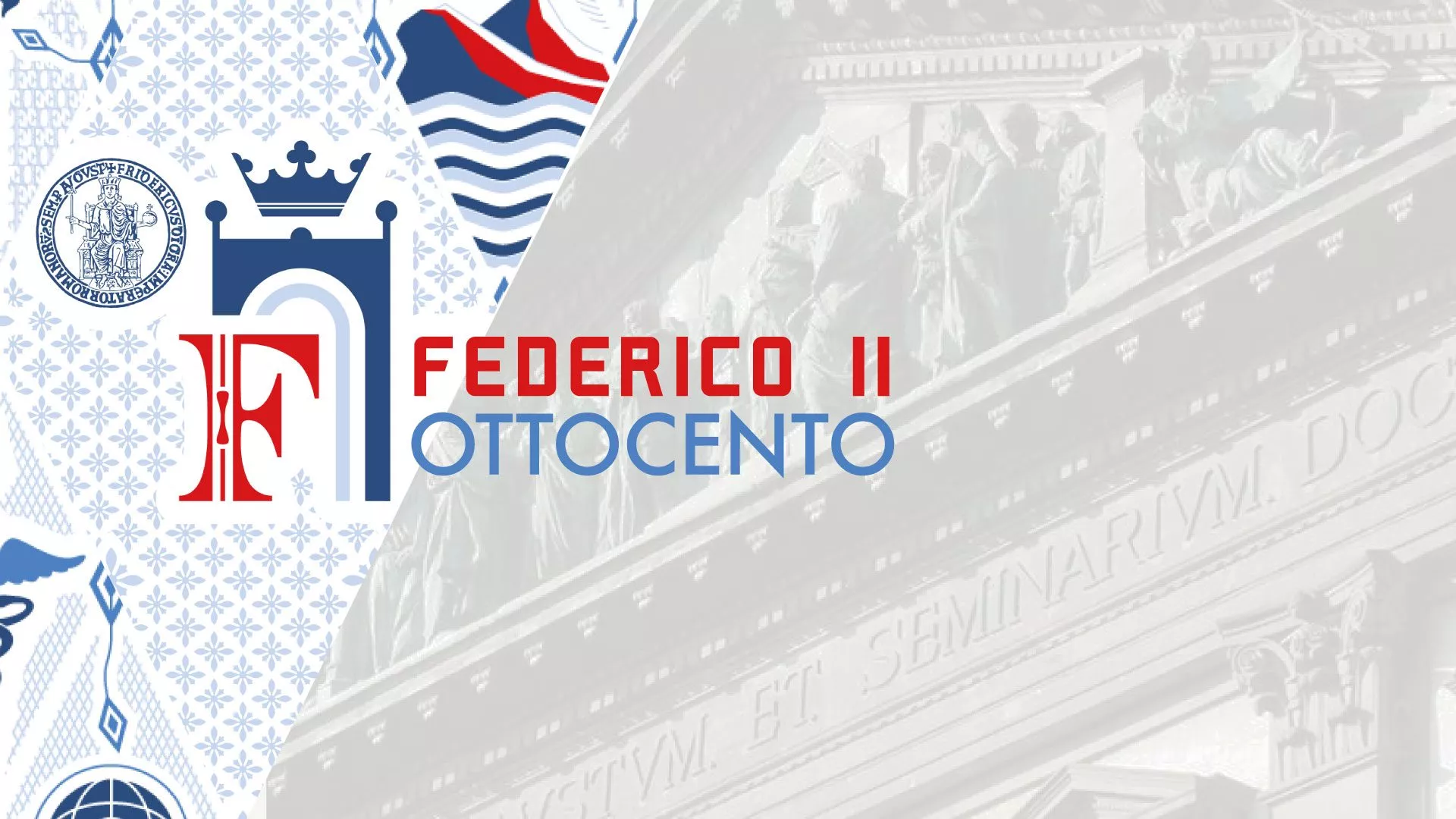
To represent the world of Frederick II we sought the collaboration of visual designer Tommaso Arosio, already our partner on many occasions, with whom we started from the symbols traditionally associated with the founder, finding inspiration for the elaboration of the graphic concept in the manuscript “De arte venandi cum avibus”, the treaty on falconry drawn up by Frederick II of Swabia between 1239 and 1248, preserved in the Vatican Apostolic Library and contains one of the most ancient and iconic images of the emperor.
The visual universe of this manuscript was the starting point for the development of a system that aims to reproduce, in a modern key, some stylistic features of the ‘200, reworked on graphics, light or slightly playful.
In the elaboration of the visual concept we have kept in mind the peculiarities that distinguish all the events that will be organized within the celebrations, as an event widespread in the territory and with an international vocation.
It was therefore necessary, starting from traditional symbols, to propose a creativity that was modern, oriented to young people attending the University, that identified the places and that communicated innovation, a strong point of the University of Naples.
Signs and colors have been identified to define the palettes, the latter then reworked and alternating with brighter tones to make them suitable for the times and a language more suited to the communicative system of destination.
It was therefore decided to keep those elements that lead back to a medieval imagination, such as the reference to the large drop cap characteristic of codici miniati that can be identified in the “F” placed inside the logo, and at the same time to use contemporary graphic forms for the creation of icons that identify the themes and subjects that will be involved in the different stages of the celebrations.
As a result we have developed a scalable pattern on different media for all the graphic co-ordination that will accompany all the communication conveyed by the University during the events and also through digital channels and traditional installations.

CONCLUSIONS

At the end of the process we created and delivered to the customer the graphic productions that have already been presented during the press conference together with the rector Matteo Lorito, the Mayor of the Municipality of Naples Gaetano Manfredi, representatives of the Campania Region and Valentina Della Corte, delegate for UniNa2024.
Here, then, is the first episode of a story that in the coming months will see Zeranta, involved with several of its Business Units, and of which we can not wait to tell you the next steps.